


Texturey Textured Text
Here's something fun... text with some texture. I was just using this technique on a project and thought it might be appropriate to share. Sometimes you need some dirty text, and although there are numerous ways to get it (I used to just erase pieces of the text with a grungy brush), this is my favorite and the most unique because it uses photo-based textures.

Here's some boring text that needs some texture. Let's do it.
STEP 1
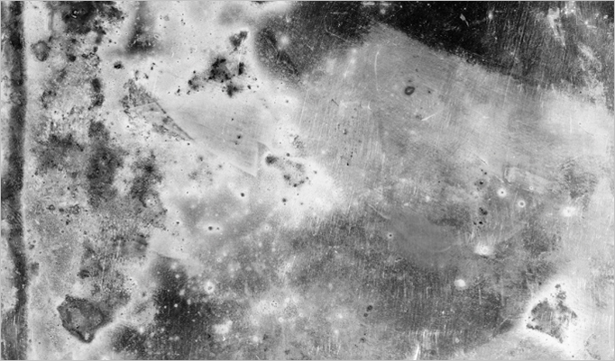
Grab a cool texture and toss it into your document with the boring text. You will want to keep in mind what kind of effect you want to get from the texture... in this case, I'm aiming to give the text a worn and decaying effect. Also, if your image isn't already in black & white, be sure you desaturate it (Cmd/Crtl + Shift + U). If you're a fancy-pants, you can use the Black & White filter and be really precise... but don't kid yourself. You are a fancy-pants.
STEP 2
Before we move on, let's make the texture a little more contrasty. I'm going to use the levels dialog so I have some control over which areas are brought out.
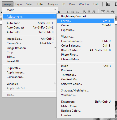
You can find Levels under Image > Adjustments > Levels, or by pressing Cmd/Ctrl + L.
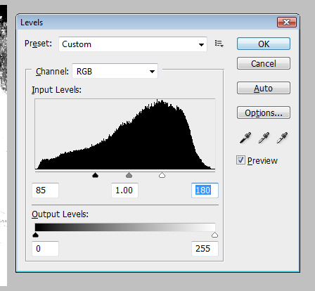
Crank the sliders inward to reduce the range. I don't want to get into the details of what the Levels dialog is doing... just play around with it for a second and it's pretty obvious. It's like contrast but with more settings to tweak.
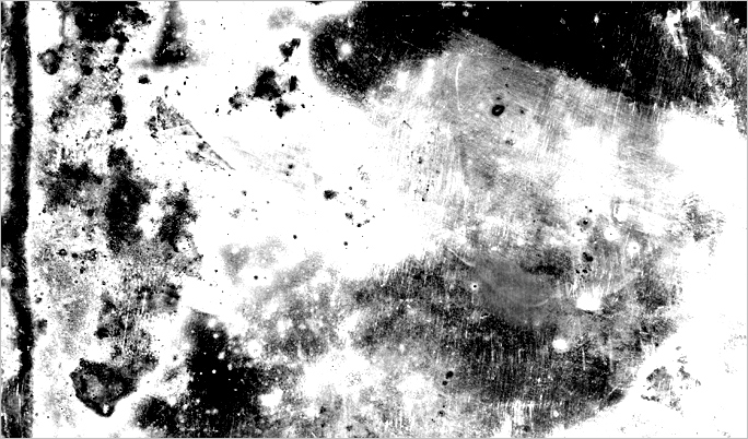
There. Extreme, right? You can see that in some areas I've blown it out a bit... this is to make sure that we keep enough of the text there so that it remains readable. The black areas are going to be masked out, so keep that in mind. If you knock out too much of your text, people won't be able to read your super important message.
STEP 3
Let's load a selection from the Channels palette.
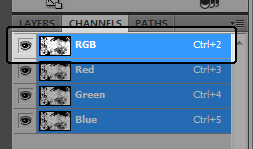
Now, the easiest way to make our selection is probably to just jump over to the Channels palette and make a selection out of the RGB channel. hold Cmd/Ctrl and click on the image thumbnail to load that as a selection.
Make sure you turn off the layer with the texture once you have it loaded as your selection, otherwise you won't be able to see all the rest of this stuff.

Now you've got a crazy wild selection, so just flip back over to your Layers palette and let's get to masking.
STEP 4
Mask time!
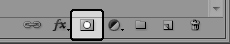
Make sure you've got your text layer selected and click the mask button at the bottom of the Layers palette.

Hot. We've got texture, just like that. I'm not sold on the placement yet though, and thanks to our non-destructive use of a mask, we can play a bit and find something we like.
STEP 5
You're not committed to the mask... you can move it.
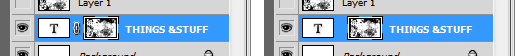
In order to move the texture and not the text itself, click the link chain between the two thumbnails to unlock the mask... then make sure you have the texture thumbnail selected and using the Move tool, you can go to town. Slide that baby around and find something that yanks your chain the way you like.

I'm into this... but before I'm done with it, I want to toss a gradient behind it.
STEP 6
In case you don't know how to use the Gradient tool...

Simple settings... foreground color to transparent... drag from the top to the bottom of your document. That's what we call a tutorial within a tutorial, folks. You know, a T.W.A.... nevermind.

I don't know that the gradient really makes it any cooler, but it was a really easy background to toss behind this "piece of work"... plus now you know how to use the gradient tool.
Actually, I don't really think I explained creating gradients that well, so I'll stop bragging about it.
You should have a grasp on adding a texture mask to your text now though... that's the upside. The mask keeps things flexible and doesn't lock you into anything if you change your mind down the road. It also comes in handy when you have a client that doesn't like "the third scrape from the left of the T in Stuff". Thanks to the mask, it's sorta easy to just Clone Stamp your way outta that one. Not awesome with the Clone Stamp yet? We'll talk later.
 Grant Essig