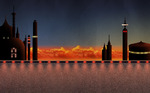
 A composite of all the static layers for a cloud city background.I don't want to give everything away, but I thought I'd share some sneak peaks at my progress so far. I'm done building the background artwork in Photoshop, and starting to build the characters. Warning: the following text is pretty process-heavy, so if you don't really care, don't read it.
I'll be bringing the background art into After Effects and creating 2.5D setpieces... which essentially means I'll be working with flat objects in a 3D space. It's like a paper diorama, but I love the way things look with a little depth of field and some dynamic lighting.
Once the character artwork is done, I'll import it into Flash to add certain movement to the characters. I prefer to do certain things (mostly mouth and some limb movement, as well as certain special movements) in Flash as opposed to After Effects, but I think that's just a personal preference. Lots of people do all their animation in After Effects, but it's all about whatever works best for you.
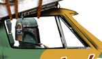 The Fett's gotta jet...One limiting factor with Flash is that animations currently can't exceed 2880 x 2880, so sometimes I have to be really creative about closeups and etc. I don't mind though, since it kind of forces me to make some decisions as I go... which means I have to plan ahead and think about what the final product is going to look like. That really helps with something like this where I'm not doing storyboards (since they pretty much already exist in the form of a finished film).
Once I get the Flash animation finished up, I import the SWF movies straight into After Effects and turn them into a 2.5D layer in the appropriate set... and then it's just a matter of adjusting things and creating some camera moves. That's always the fun part, but it's followed by the not fun part — rendering.
Because my sets generally consist of a number of really high-resolution textures, and numerous SWF layers, as well as camera moves and lights, the rendering process can be a drag. When pushing the software to its limit, crashes while rendering are pretty common, so I often sit and watch my renders pretty closely. Of course, with a 15 second piece that won't be terribly painful, but with longer pieces I've worked on, it can take hours and hours to churn out a couple minutes of footage... in case you were wondering.
So anyway, it's back to work for now. I'll share more soon.


 Grant Essig
;)
;)
;)