<?xml version="1.0" encoding="UTF-8"?>
<!--Generated by Squarespace Site Server v5.11.81 (http://www.squarespace.com/) on Thu, 31 May 2012 13:27:15 GMT--><feed xmlns="http://www.w3.org/2005/Atom" xmlns:dc="http://purl.org/dc/elements/1.1/"><title>Grant Essig: Tutorial City</title><subtitle>Tutorial City</subtitle><id>http://www.grantessig.com/tutorial-city/</id><link rel="alternate" type="application/xhtml+xml" href="http://www.grantessig.com/tutorial-city/"/><link rel="self" type="application/atom+xml" href="http://www.grantessig.com/tutorial-city/atom.xml"/><updated>2011-07-20T02:11:25Z</updated><generator uri="http://www.squarespace.com/" version="Squarespace Site Server v5.11.81 (http://www.squarespace.com/)">Squarespace</generator><entry><title>Fun With Blend Modes</title><category term="Blend Modes"/><category term="Photo Editing"/><category term="Photoshop"/><category term="Texture"/><id>http://www.grantessig.com/tutorial-city/fun-with-blend-modes.html</id><link rel="alternate" type="text/html" href="http://www.grantessig.com/tutorial-city/fun-with-blend-modes.html"/><author><name>Grant Essig</name></author><published>2010-11-03T04:00:27Z</published><updated>2010-11-03T04:00:27Z</updated><content type="html" xml:lang="en-US"><![CDATA[<p>In celebration of the upcoming Artfix event, I'm going to share with you how I created my piece for the auction, <em>Orangefield Road</em>. It's mostly just a combination of the right photos and blend modes.</p>
<p>Also, for whatever it's worth, I'm tossing out what I'm listening to while creating this tutorial. The mood is always so important for me when I'm working, and for this vintage-ish project, I've picked a favorite of mine that feels so deliciously vintage: <a class="offsite-link-inline" href="http://www.amazon.com/Vignetting-The-Compost/dp/B003DUMNX6/ref=sr_1_6?ie=UTF8&amp;qid=1288761047&amp;sr=8-6" target="_blank"><em>Vignetting The Compost</em> by Bibio</a>.</p>
<p>&nbsp;Pfft... <em>deliciously vintage</em>. I'm such a douchebag. Oh well, here we go.</p>
<p><span class="full-image-block ssNonEditable"><span><img src="http://www.grantessig.com/storage/tutorials/BackgroundImage.jpg?__SQUARESPACE_CACHEVERSION=1288757063618" alt="" /></span></span></p>
<p><strong>STEP 1</strong></p>
<p>
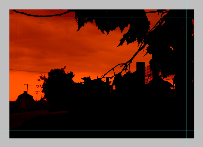
I started the background with a super contrasty image with some bold color, as the rest of our images will be a lot of fun to lay over this. You will notice I have my guides pulled in for bleed. You don't really need to worry about those for this tutorial, but since I'm working out of my original file, they're there. Deal with it.</p>
<p><span class="full-image-block ssNonEditable"><span><img src="http://www.grantessig.com/storage/tutorials/SecondImage.jpg?__SQUARESPACE_CACHEVERSION=1288757308165" alt="" /></span></span></p>
<p><strong>STEP 2</strong></p>
<p>
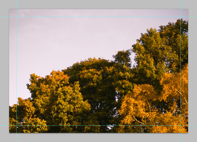
Now we'll add our first overlay. I chose an image that would look like a treeline in the background, so before we start blending, we're going to mask out some of this using the background layer as a guide.</p>
<p><span class="full-image-block ssNonEditable"><span><img src="http://www.grantessig.com/storage/tutorials/RedChannel.jpg?__SQUARESPACE_CACHEVERSION=1288757431232" alt="" /></span></span></p>
<p>
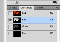
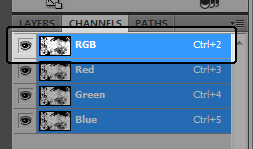
To make our selection, first click on the background layer, and then over to the channels palette. We'll use the Red layer to make our selection, since it has a ton of contrast.</p>
<p><span class="full-image-block ssNonEditable"><span><img src="http://www.grantessig.com/storage/tutorials/SelectColorRange.jpg?__SQUARESPACE_CACHEVERSION=1288757573855" alt="" /></span></span></p>
<p>
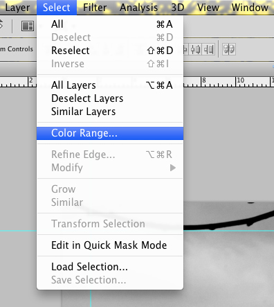
Under the select menu, choose Color Range. This is going to make our selection really easy to grab.</p>
<p><span class="full-image-block ssNonEditable"><span><img src="http://www.grantessig.com/storage/tutorials/ColorRangeDialog.jpg?__SQUARESPACE_CACHEVERSION=1288757655336" alt="" /></span></span></p>
<p>
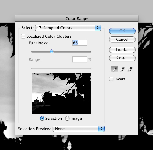
Once the dialog is open, you will be able to use the eyedropper to select any color in your image and then you will use the slider to determine the 'fuzziness' of your selection, or more or less how soft it will be. In this case, we just want to select the black and drop the slider somewhere around 60-70. Click OK when you're done and you'll have a selection all ready to go.&nbsp;</p>
<p>Make sure you select the RGB layer in the channels palette before jumping back over to your layers.</p>
<p><span class="full-image-block ssNonEditable"><span><img src="http://www.grantessig.com/storage/tutorials/MaskedImage.jpg?__SQUARESPACE_CACHEVERSION=1288757882811" alt="" /></span></span></p>
<p>
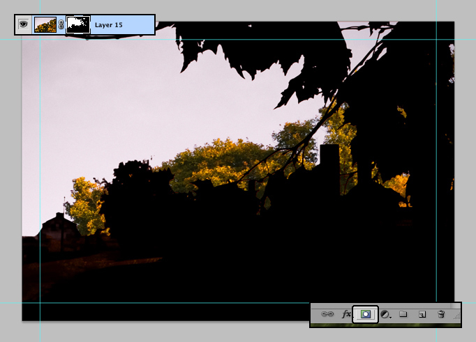
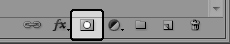
Now, back on the layer with the second image (make sure that layer is selected now, not the background), click the mask icon at the bottom of the layers palette to turn your selection into a mask. You'll notice it's not 100% perfect, but for our purposes, a little 'dirt' is okay.
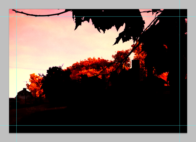
</p>
<p><span class="full-image-block ssNonEditable"><span><img src="http://www.grantessig.com/storage/tutorials/SecondImageLinearLight.jpg?__SQUARESPACE_CACHEVERSION=1288758019465" alt="" /></span></span></p>
<p><strong>STEP 3</strong></p>
<p>Now let's change the blend mode (the dropdown box at the top left of the layers palette) to Linear Light and you'll notice things are already looking better. The red background image is coloring our treeline from the second image really nicely, but there's not quite enough color showing through, so we'll just pull the opacity down on the second image.</p>
<p><span class="full-image-block ssNonEditable"><span><img src="http://www.grantessig.com/storage/tutorials/SecondImageOpacity.jpg?__SQUARESPACE_CACHEVERSION=1288758165269" alt="" /></span></span></p>
<p>
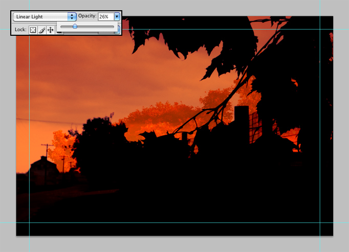
By pulling the opacity down to around 25%, We've brought back some of the bold color and given the trees a bit of a 'foggy' look, actually adding some subtle realism. Not that realism is at all the final goal here, but it's good to keep reality in mind even when playing around with it. Generally, I aim to give a photo collage like this a strong anchor in reality, but make it overall very surreal. In fact, what we're doing here is juxtaposing several different vantage points and focal lengths to create one landscape where things feel real, but they're not quite.&nbsp;</p>
<p>Uhg, enough hair-brained theory.</p>
<p><span class="full-image-block ssNonEditable"><span><img src="http://www.grantessig.com/storage/tutorials/ThirdImage.jpg?__SQUARESPACE_CACHEVERSION=1288758572498" alt="" /></span></span></p>
<p><strong>STEP 4</strong></p>
<p>
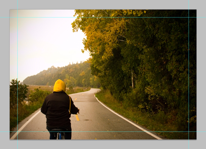
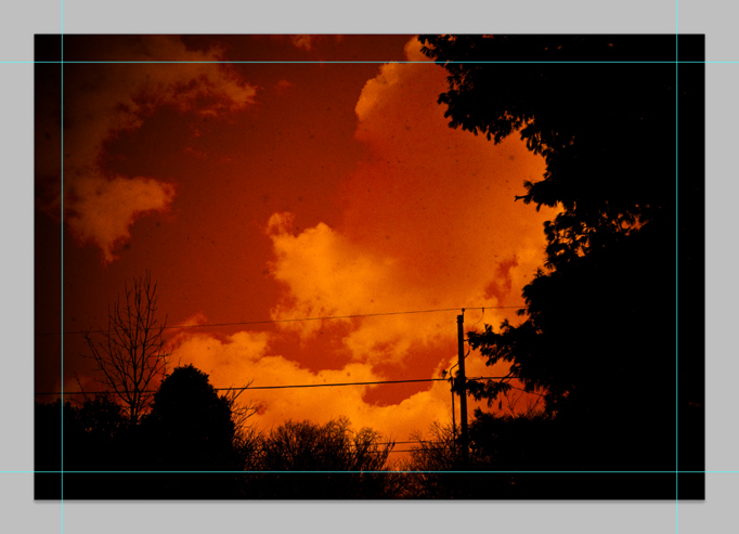
For the third image, I selected one with some nice distant trees. That's really all we'll be using from this one, but the beauty of the blend mode magic is that all the colors and textures elsewhere on this layer will add to the rest in unpredictable ways. That's really the beauty of blend mode collages... set it to blend and see what happens. Sometimes it's a trainwreck, but sometimes it's inexplicably just art.</p>
<p><span class="full-image-block ssNonEditable"><span><img src="http://www.grantessig.com/storage/tutorials/ThirdImageOverlay.jpg?__SQUARESPACE_CACHEVERSION=1288758756386" alt="" /></span></span></p>
<p>Set the third image to overlay and we're really starting to get somewhere now! Check out that crazy vintage-lookin' sky... and see how it's starting to feel like a cohesive image? This still needs something to make it work though, perhaps something with a little more warmth and some clouds. Mind you, when I'm working these kind of collages out, I often go through like 92 different options before finding the right combination... but I've streamlined it a bit here for you.</p>
<p><span class="full-image-block ssNonEditable"><span><img src="http://www.grantessig.com/storage/tutorials/FourthImage.jpg?__SQUARESPACE_CACHEVERSION=1288759036583" alt="" /></span></span></p>
<p><strong>STEP 5</strong></p>
<p>
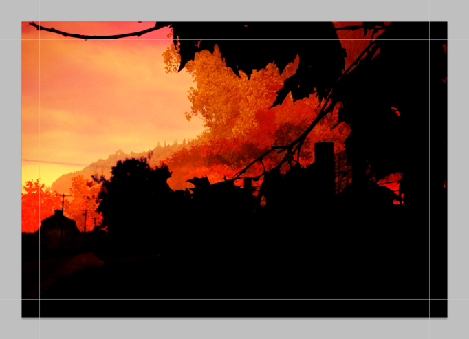
For our fourth image, I landed on something with some more contrast and yes, clouds. This should mix in there really nicely. Also, this image adds some great texture thanks to what looks like dust specks all over the image (it's actually snow... I took this picture while it was snowing).</p>
<p><span class="full-image-block ssNonEditable"><span><img src="http://www.grantessig.com/storage/tutorials/FourthImagePinLight.jpg?__SQUARESPACE_CACHEVERSION=1288759161141" alt="" /></span></span></p>
<p>For this particular image, the Pin Light blend mode seemed to have a particularly interesting effect, but I know that I need to turn that opacity down so we can get back the original elements to some extent. Once they mix in a little bit, the powerlines crossing through the shot should make a nice effect.</p>
<p><span class="full-image-block ssNonEditable"><span><img src="http://www.grantessig.com/storage/tutorials/FourthImageOpacity.jpg?__SQUARESPACE_CACHEVERSION=1288759314557" alt="" /></span></span></p>
<p>
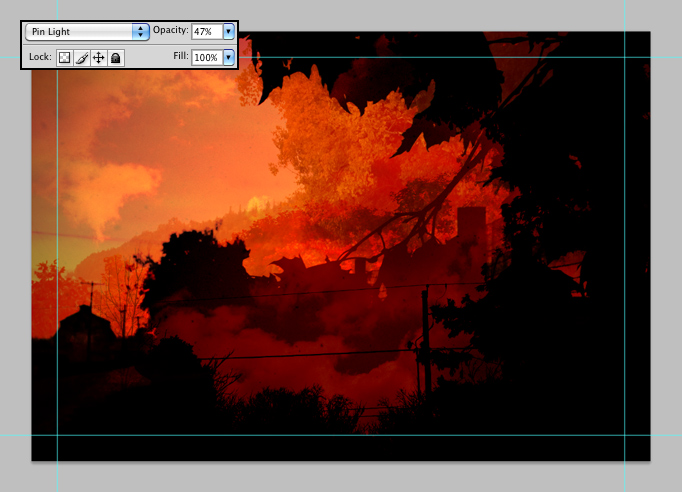
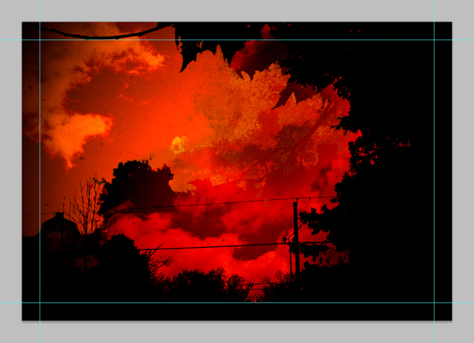
By turning the opacity down to around 50%, we've got a really great mix of everything going on now. The clouds are having a really great effect on the contrasty black areas on the background image and there's an interesting interplay happening between the black areas on this top layer and the background layer. In some spots, the line has started to blur a bit. This feels a touch dark still though... and I know just the answer.
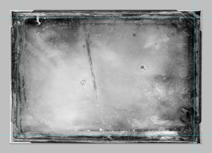
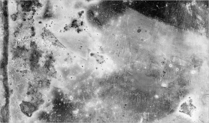
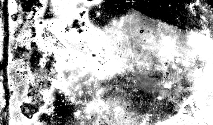
</p>
<p><span class="full-image-block ssNonEditable"><span><img src="http://www.grantessig.com/storage/tutorials/Texture.jpg?__SQUARESPACE_CACHEVERSION=1288759487191" alt="" /></span></span></p>
<p><strong>STEP 6</strong></p>
<p>By adding a black &amp; white texture, such as this messy photo plate, we can help glue all of our pieces together better and brighten everything up a hair while we're at it. This should also help us achieve a more vintage look, which is what I'm going for. You onboard for that?</p>
<p><span class="full-image-block ssNonEditable"><span><img src="http://www.grantessig.com/storage/tutorials/FinalBlendWithGuides.jpg?__SQUARESPACE_CACHEVERSION=1288759626341" alt="" /></span></span></p>
<p>
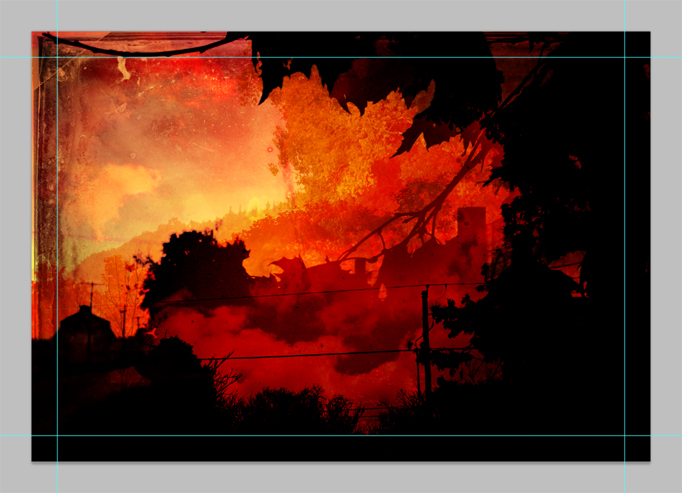
Just set that texture to overlay and lookie there... that's a crazy, surreal scene. Blend modes can also be used in very realistic, constructive ways obviously, but I thought it would be interesting to show how cool the results can be if you have some fun with the tools.</p>
<p>Let me remind you again that it took me hours and hours of toying to get to this point initially, trying all kinds of different blends and opacities on all different sorts of images before getting somewhere I liked. For you, I've just presented the actual process of gluing together the final pieces. The 'figuring things out' has to be done by you when you take something like this on yourself.</p>
<p><span class="full-image-block ssNonEditable"><span><img src="http://www.grantessig.com/storage/tutorials/Artfix_OrangefieldRoad.jpg?__SQUARESPACE_CACHEVERSION=1288759983188" alt="" /></span></span></p>
<p>
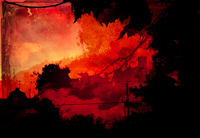
So this is the final image. I tweaked the colors on the final version a bit, to make it just a touch more magenta-filled, but that's it.</p>
<p><strong>IMPORTANT NOTE</strong>: Blend modes work differently in RGB and CMYK. This tutorial is working in RGB with the intentions of jumping to CMYK as a final step. Obviously, if you're planning to do this, constant CMYK checks are important... Option (Ctrl) + Y allows you to do a quick CMYK preview while working in RGB. There are other things to consider as well (when jumping from RGB to CMYK) but I'll save that for another day.</p>
<p>To close this one out, I've included the images I used so you can try it out for yourself. Enjoy, and good luck.</p>
<p><span class="thumbnail-image-inline ssNonEditable"><span><a href="javascript:showFullImage('/display/ShowImage?imageUrl=%2Fstorage%2Ftutorials%2FRaw_Image1.jpg%3F__SQUARESPACE_CACHEVERSION%3D1288760362716',694,1000);"><img src="http://www.grantessig.com/storage/thumbnails/7417002-9246298-thumbnail.jpg?__SQUARESPACE_CACHEVERSION=1288760362716" alt="" /></a></span></span><span class="thumbnail-image-inline ssNonEditable"><span><a href="javascript:showFullImage('/display/ShowImage?imageUrl=%2Fstorage%2Ftutorials%2FRaw_Image2.jpg%3F__SQUARESPACE_CACHEVERSION%3D1288760406744',694,1000);"><img src="http://www.grantessig.com/storage/thumbnails/7417002-9245730-thumbnail.jpg?__SQUARESPACE_CACHEVERSION=1288760406744" alt="" /></a><span class="thumbnail-image-inline ssNonEditable"><span><a href="javascript:showFullImage('/display/ShowImage?imageUrl=%2Fstorage%2Ftutorials%2FRaw_Image3.jpg%3F__SQUARESPACE_CACHEVERSION%3D1288760461312',694,1000);"><img src="http://www.grantessig.com/storage/thumbnails/7417002-9246324-thumbnail.jpg?__SQUARESPACE_CACHEVERSION=1288760465149" alt="" /></a><span class="thumbnail-image-inline ssNonEditable"><span><a href="javascript:showFullImage('/display/ShowImage?imageUrl=%2Fstorage%2Ftutorials%2FRaw_Image4.jpg%3F__SQUARESPACE_CACHEVERSION%3D1288760501305',694,1000);"><img src="http://www.grantessig.com/storage/thumbnails/7417002-9246333-thumbnail.jpg?__SQUARESPACE_CACHEVERSION=1288760510941" alt="" /></a><span class="thumbnail-image-inline ssNonEditable"><span><a href="javascript:showFullImage('/display/ShowImage?imageUrl=%2Fstorage%2Ftutorials%2FRaw_Texture.jpg%3F__SQUARESPACE_CACHEVERSION%3D1288760543708',694,1000);"><img src="http://www.grantessig.com/storage/thumbnails/7417002-9246343-thumbnail.jpg?__SQUARESPACE_CACHEVERSION=1288760546207" alt="" /></a></span></span></span></span></span></span></span></span></p>]]></content></entry><entry><title>Texturey Textured Text</title><category term="Levels"/><category term="Masks"/><category term="Photoshop"/><category term="Text"/><category term="Texture"/><id>http://www.grantessig.com/tutorial-city/texturey-textured-text.html</id><link rel="alternate" type="text/html" href="http://www.grantessig.com/tutorial-city/texturey-textured-text.html"/><author><name>Grant Essig</name></author><published>2010-09-20T02:17:48Z</published><updated>2010-09-20T02:17:48Z</updated><content type="html" xml:lang="en-US"><![CDATA[<p>Here's something fun... text with some texture. I was just using this technique on a project and thought it might be appropriate to share. Sometimes you need some dirty text, and although there are numerous ways to get it (I used to just erase pieces of the text with a grungy brush), this is my favorite and the most unique because it uses photo-based textures.</p>
<p><span class="full-image-block ssNonEditable"><span><img src="http://www.grantessig.com/storage/BasicText.jpg?__SQUARESPACE_CACHEVERSION=1284949654887" alt="" /></span></span></p>
<p>Here's some boring text that needs some texture. Let's do it.</p>
<p><span class="full-image-block ssNonEditable"><span><img src="http://www.grantessig.com/storage/PastedTexture.jpg?__SQUARESPACE_CACHEVERSION=1284949898029" alt="" /></span></span></p>
<p><strong>STEP 1</strong></p>
<p>Grab a cool texture and toss it into your document with the boring text. You will want to keep in mind what kind of effect you want to get from the texture... in this case, I'm aiming to give the text a worn and decaying effect. Also, if your image isn't already in black &amp; white, be sure you desaturate it (Cmd/Crtl + Shift + U). If you're a fancy-pants, you can use the Black &amp; White filter and be really precise... but don't kid yourself. You <em>are</em> a fancy-pants.</p>
<p><strong>STEP 2</strong></p>
<p>Before we move on, let's make the texture a little more contrasty. I'm going to use the levels dialog so I have some control over which areas are brought out.</p>
<p><span class="full-image-block ssNonEditable"><span><img src="http://www.grantessig.com/storage/Levels.jpg?__SQUARESPACE_CACHEVERSION=1284950067096" alt="" /></span></span></p>
<p>You can find Levels under Image &gt; Adjustments &gt; Levels, or by pressing Cmd/Ctrl + L.</p>
<p><span class="full-image-block ssNonEditable"><span><img src="http://www.grantessig.com/storage/LevelsDialog.jpg?__SQUARESPACE_CACHEVERSION=1284950259920" alt="" /></span></span></p>
<p>Crank the sliders inward to reduce the range. I don't want to get into the details of what the Levels dialog is doing... just play around with it for a second and it's pretty obvious. It's like contrast but with more settings to tweak.</p>
<p><span class="full-image-block ssNonEditable"><span><img src="http://www.grantessig.com/storage/TextureWithLevels.jpg?__SQUARESPACE_CACHEVERSION=1284950756559" alt="" /></span></span></p>
<p>There. Extreme, right? You can see that in some areas I've blown it out a bit... this is to make sure that we keep enough of the text there so that it remains readable. The black areas are going to be masked out, so keep that in mind. If you knock out too much of your text, people won't be able to read your <em>super</em> important message.</p>
<p><strong>STEP 3</strong></p>
<p>Let's load a selection from the Channels palette.</p>
<p><span class="full-image-block ssNonEditable"><span><img src="http://www.grantessig.com/storage/Channels.jpg?__SQUARESPACE_CACHEVERSION=1284951006629" alt="" /></span></span></p>
<p>Now, the easiest way to make our selection is probably to just jump over to the Channels palette and make a selection out of the RGB channel. hold Cmd/Ctrl and click on the image thumbnail to load that as a selection.</p>
<p>Make sure you turn off the layer with the texture once you have it loaded as your selection, otherwise you won't be able to see all the rest of this stuff.</p>
<p><span class="full-image-block ssNonEditable"><span><img src="http://www.grantessig.com/storage/ChannelSelection.jpg?__SQUARESPACE_CACHEVERSION=1284951097706" alt="" /></span></span></p>
<p>Now you've got a crazy wild selection, so just flip back over to your Layers palette and let's get to masking.</p>
<p><strong>STEP 4</strong></p>
<p>Mask time!</p>
<p><span class="full-image-block ssNonEditable"><span><img src="http://www.grantessig.com/storage/MaskIcon.jpg?__SQUARESPACE_CACHEVERSION=1284951251838" alt="" /></span></span></p>
<p>Make sure you've got your text layer selected and click the mask button at the bottom of the Layers palette.</p>
<p><span class="full-image-block ssNonEditable"><span><img src="http://www.grantessig.com/storage/MaskApplied.jpg?__SQUARESPACE_CACHEVERSION=1284951304970" alt="" /></span></span></p>
<p>Hot. We've got texture, just like that. I'm not sold on the placement yet though, and thanks to our non-destructive use of a mask, we can play a bit and find something we like.</p>
<p><strong>STEP 5</strong></p>
<p>You're not committed to the mask... you <em>can</em> move it.</p>
<p><span class="full-image-block ssNonEditable"><span><img src="http://www.grantessig.com/storage/UnlockMask.jpg?__SQUARESPACE_CACHEVERSION=1284951471924" alt="" /></span></span></p>
<p>In order to move the texture and not the text itself, click the link chain between the two thumbnails to unlock the mask... then make sure you have the texture thumbnail selected and using the Move tool, you can go to town. Slide that baby around and find something that yanks your chain the way you like.</p>
<p><span class="full-image-block ssNonEditable"><span><img src="http://www.grantessig.com/storage/MovedMask.jpg?__SQUARESPACE_CACHEVERSION=1284951810551" alt="" /></span></span></p>
<p>I'm into this... but before I'm done with it, I want to toss a gradient behind it.</p>
<p><strong>STEP 6</strong></p>
<p>In case you don't know how to use the Gradient tool...</p>
<p><span class="full-image-block ssNonEditable"><span><img src="http://www.grantessig.com/storage/GradientSettings.jpg?__SQUARESPACE_CACHEVERSION=1284952143082" alt="" /></span></span></p>
<p>Simple settings... foreground color to transparent... drag from the top to the bottom of your document. That's what we call a tutorial within a tutorial, folks. You know, a T.W.A.... nevermind.</p>
<p><span class="full-image-block ssNonEditable"><span><img src="http://www.grantessig.com/storage/FinalImage.jpg?__SQUARESPACE_CACHEVERSION=1284952598411" alt="" /></span></span></p>
<p>I don't know that the gradient really makes it any cooler, but it was a really easy background to toss behind this "piece of work"... plus now you know how to use the gradient tool.</p>
<p>Actually, I don't really think I explained creating gradients that well, so I'll stop bragging about it.</p>
<p>You <em>should</em> have a grasp on adding a texture mask to your text now though... that's the upside. The mask keeps things flexible and doesn't lock you into anything if you change your mind down the road. It also comes in handy when you have a client that doesn't like "the third scrape from the left of the T in Stuff". Thanks to the mask, it's sorta easy to just Clone Stamp your way outta that one. Not awesome with the Clone Stamp yet? We'll talk later.</p>]]></content></entry><entry><title>Straighten Your Horizon</title><category term="Arbitrary"/><category term="Image Rotation"/><category term="Photo Editing"/><category term="Photoshop"/><category term="Ruler"/><id>http://www.grantessig.com/tutorial-city/2010/8/14/straighten-your-horizon.html</id><link rel="alternate" type="text/html" href="http://www.grantessig.com/tutorial-city/2010/8/14/straighten-your-horizon.html"/><author><name>Grant Essig</name></author><published>2010-08-14T12:59:15Z</published><updated>2010-08-14T12:59:15Z</updated><summary type="html" xml:lang="en-US"><![CDATA[<em>someone</em>]]></summary></entry></feed>
