Crossfit is a hot new workout regimen that has started to take off, but most gyms are still ignoring the idea of branding and identity, which is what made this project exciting... it's always fun to be the first. Crossfit Gambit is now one of the only Crossfit gyms in the country with a fully cohesive look and feel.
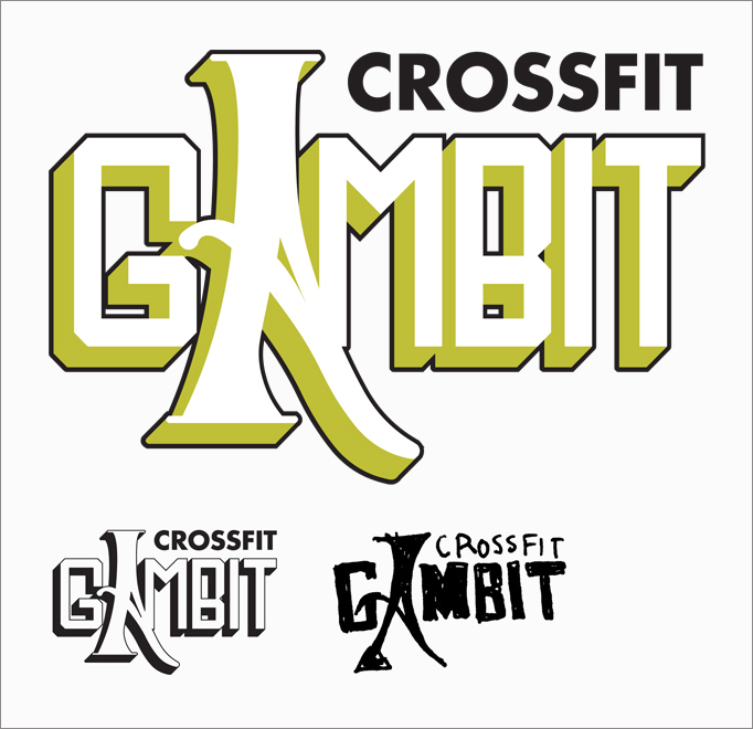
The name finds some influence from a comic book character, so (with the help of designer Michael Forbis, who provided the initial sketch pictured above) we decided to pay homage to that relationship with a logo that would have felt at home on the cover of a comic. It's a strong, yet not overly masculine logo, which does a good deal to sum up what Crossfit is about, and even more so what Crossfit Gambit is about.
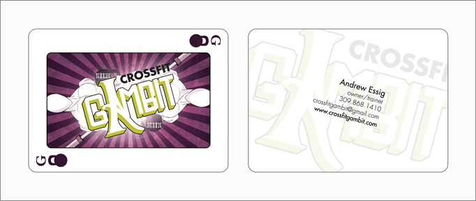
Referencing comics again, the playing card idea surfaced as an alternative to traditional business cards. We had them sized and cut to match real playing cards. Our superhero of inspiration was known for tossing them as weapons, so they became a fun aspect of the brand, and a great way to inject uniqueness into simple print pieces.
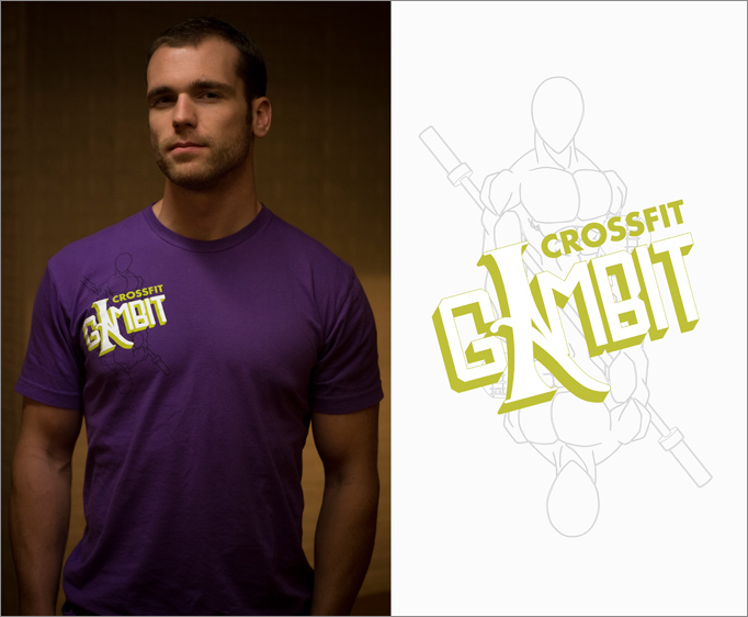
A crucial element to the look of the gym would be the wardrobe, so there was great care taken in making sure t-shirts for the trainers and employees would look hip and fit well. It always helps when your client gets as much enjoyment as you do out of designing really cool stuff and helping brainstorm new ideas.
A Crossfit Gambit blog was also created to match the brand, and signage for the gym's new facilities is in the works currently.